

A Designer’s Love Story: Like Turquoise Paradise

©Marc Mauldin Photography Inc.
It’s funny thinking back to when I first started designing our guest bedroom—because, if I’m being honest, I completely did it backwards. Most interior designers start with paint or wallpaper first, then move on to furniture and décor. Me? I had all the furniture and decor in place before I even decided on a paint color and wallpaper. And let me tell you, that made things more complicated.
On top of that, I wasn’t even sure what design style I wanted to go with. I was torn between Aphrochic and Eclectic, and going through a blush pink phase that led me to try out IKEA drapery—which turned out to be a total disaster. I couldn’t find the right bedding, so I threw on a blanket from Costco. I experimented with a floating nightstand from Etsy, hoping for something unique while supporting small businesses. Below the TV, I filled the dresser on top with HomeGoods finds... only to end up with a cluttered mess.
I was all over the place.
THE BEFORE:


In hindsight, I made some temporary decisions and wasted some money along the way. What I learned is this: it’s so important to know what you truly want before diving in. It saves you time, energy, and frustration.
Eventually, I shifted my mindset. I started thinking about the emotional connection I wanted to have with this room. I already had a few key pieces I loved—our TV, our black dressers, the bed, the white ottoman, and that chandelier, yes!!. So, I let those be my anchor. From there, I finally found the right wallpaper, the perfect paint color, drapery that actually worked, and just one additional furniture piece that pulled everything together.
That’s when this space really started to come together and feel like paradise.
With the foundation finally in place that brought warmth and the feeling I wanted to create—I knew it was time to tackle one of the most impactful elements in the room: the paint.
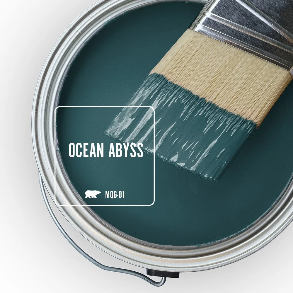
After all the trial and error, I realized that the right wall color could either elevate everything I had already built—or completely throw it off. I wasn’t just picking a shade for the sake of it anymore. This time, I wanted a color that spoke to the mood of the room, that made people feel calm the second they walked in. It needed to tie everything together, so I selected Ocean Abyss by Behr. Choosing this dark rich turquoise color became more than just a design decision—it became part of the emotional connection I was building with the space.

©Marc Mauldin Photography Inc.
With the paint chosen and the mood of the room beginning to take shape, I realized there was still one key element missing—a piece of furniture to sit beside the bed. I wanted something tall, with storage, but it couldn’t be black. I already had enough of that in the space, and I needed something to break it up and add a little contrast.
So, I made my way to Nadeau Furniture in Buckhead, and as soon as I walked in, I saw it. A beautiful six-drawer dresser that stopped me in my tracks. The texture, the color, the craftsmanship—it was everything I didn’t even know I was looking for. Made of solid wood with a natural, slightly weathered finish, it had this earthy warmth that instantly softened the bold contrast of the black dresser in the room. The grain of the wood gave it character, with each drawer front showcasing unique markings like little stories etched into the surface. It had simple, clean lines, but there was a subtle handcrafted charm that made it feel special—almost like a piece you’d discover while traveling, then treasure for years. And it was heavy—the kind of weight that says, “I’m here to stay.” It felt like a forever piece, something timeless that would only get better with age. I knew instantly it was coming home with me.
Once I had the six-drawer dresser in place, it was time for one of my favorite parts—accessorizing. I wanted the top of the dresser to feel curated but personal, layered with pieces that told a story. I headed to HomeGoods (of course!) and found the perfect pair: a black tall vase, a smaller one to balance it, and a purple candle that added just the right touch of warmth and coziness.
Then I added something that’s been with me for years—my Van Gogh art book from college. It’s one of those pieces I’ve carried with me through different homes and seasons of my life, and it just felt right to give it a place here.
But the real centerpiece was the artwork. I knew I wanted something that would take me back to my childhood—something soulful and meaningful. That’s when “Juneteenth” by Halimah Smith (@artpce.com) crossed my eye, and I absolutely fell in love. Her illustration captured the essence of my upbringing in a way that felt deeply personal. It was joyful, full of history, and heart.
To finish it off, I took it to Michaels for some custom framing. Before Framebridge they were my go-to at the time—especially with their modern thick white frames, which are hands-down my favorite. The final look brought everything together. It wasn’t just décor anymore—it was a reflection of who I am and where I came from.

©Marc Mauldin Photography Inc.
With the dresser styled and artwork in place, the room was really starting to feel like me. But no paradise is complete without the perfect bedding. I knew from the start that I wanted to go with white—it's timeless, clean, and pairs effortlessly with any color palette. White bedding has a way of making a space feel fresh and inviting, and for a guest room, that was essential.
I turned to ZGallerie because they always deliver when it comes to luxurious textures without the sky-high price tag. Their pieces just feel elevated, and I wanted that touch of everyday luxury layered into the space.
To keep that luxe, cozy vibe going, I brought in a mix of accent pillows. I found a pair of purple square pillows on Amazon—they added a pop of color and a sense of calm sophistication. Then, for a fun contrast and a little unexpected edge, I made a quick trip to the West Elm Outlet in Dawsonville and picked up a honeycomb mustard yellow print pillow. It brought warmth and personality to the bed, tying back into the natural tones of the dresser and the joyful artwork above it.
With the bedding complete and the bed finally looking like the luxurious focal point I had envisioned; I shifted my attention to the space beneath the TV. My goal was to keep it minimal yet bold, letting every element speak without overwhelming the space. I also saw it as the perfect opportunity to weave in more Afrocentric style, continuing the cultural thread I had started with the “Juneteenth” artwork. It was important to me that this room didn’t just look beautiful—it had to reflect identity, heritage, and soul.

©Marc Mauldin Photography Inc.
To anchor the space below the TV, I started with something deeply personal—my Los Angeles signage art. It’s a piece I’ve held onto since we moved to Atlanta 16 years ago, and it carries so many memories. Framing it felt like honoring a part of my journey, bringing a bit of my past into this new, evolved space.
Another trip to HomeGoods in Dawsonville proved fruitful (as always), where I found a striking black vase and a beautiful African statue handcrafted in Ghana. Both pieces were exactly what I needed to carry the cultural energy from the artwork into this corner of the room—bold, grounded, and full of meaning.
Thinking about my guests' comfort, I also wanted to make sure cozy touches were within easy reach. So I returned to Nadeau Furniture and picked up a wood ladder to serve as a blanket holder. It's simple, functional, and adds a warm, rustic texture that perfectly complements the other natural elements in the room.

©Marc Mauldin Photography Inc.
One of the most exciting moments was framing “Purple Reign”, a stunning poster by Washington D.C.-based artist and fashion designer Yvette Crocker. Her work is vibrant, powerful, and unapologetically Black—everything I wanted this room to embody.
And to truly bring everything together, I called up the team at The Boardroom Accent Walls for one final feature: a custom accent wall installation of “falling slats”. This was the cherry on top, adding architectural depth and a modern statement that elevated the room to a whole new level of design.

©Marc Mauldin Photography Inc.
Let me just say, I am so thankful for Instagram. It’s where I discover most of my design inspiration and resources, and one day I stumbled across a gem: Mitchell Black, a Black woman-owned wallcovering and art brand based in Lincoln Park, IL. The moment I started browsing their collections, I knew I had found something special. Their designs were vibrant, intentional, and deeply rooted in cultural expression. I was in heaven.
I had been purposefully searching for a wallpaper design that incorporated turquoise and yellow—two colors that not only complemented the room’s palette but also brought energy and warmth. That’s when I found Zaire – Teal by Forbes+Masters, and I knew instantly: this was the one. It was bold. It was artistic. It was everything I had been envisioning.
I opted for the peel-and-stick version and brought in the best wallpaper installers in Atlanta—Atlantic Wallpapers. Let me tell you, they were divine. Incredibly knowledgeable, professional, and just a joy to work with from start to finish. Watching the wallpaper go up was such a satisfying moment—it was like the room finally took a deep breath and settled into itself.
Did I also mention music icons, Nina Simone and the one, the only: Sade! These two legends needed a space on the wall, and I knew I wanted to do something a little more special than a standard frame job.
Enter: a little creativity and some leftover peel & stick wallpaper I had lying around. I took a pair of simple $25 black frames from HomeGoods—great on their own, but the white mats felt a little too plain for the energy these queens bring. So I gave them a mini makeover.
Using the wallpaper, I covered the mats to create a bold, custom look that made the portraits pop. It was such a fun (and surprisingly easy) DIY that added texture, pattern, and personality—plus, it cost next to nothing since I used what I already had.
The result? Statement pieces that feel curated, meaningful, and 100% me. Nina and Sade never looked better.


Designing this room was more than just picking a paint color and pillows—it was about creating a space that felt like love, comfort, and identity. There were moments of uncertainty (and a few decorating disasters along the way), but every step taught me something: about patience, about trusting my instincts, and about the power of designing with emotion.
This room is no longer just a guest bedroom. It’s a reflection of where I’ve been, who I am, and what I value. It holds memories, meaning, and intention in every corner. And the best part? Now, when friends and family come to visit, they’re stepping into a space that was designed not just to look good—but to feel like home.
If you’re dreaming of transforming a room in your own home, my advice is simple: don’t rush the process. Let it evolve. Fill it with pieces that speak to your soul, not just what looks good on Instagram. Trust that your vision, your culture, your memories—they belong in your space. Because when you design from the heart, you don’t just create a beautiful room… you create your own little paradise.
IT’S ALL IN THE DETAILS:
Design & Organization: Its Not Complicated Organizing
Photography: Marc Mauldin Photography Inc.
Primary Paint: Behr, Ocean Abyss
3D Accent Wall Installation: The Boardroom Accent Walls, Atlanta
Wallpaper: Mitchell Black, Zaire - Teal: Forbes+Masters
Wallpaper Installation: Atlantic Wallpapers
Juneteenth Poster: Artpce, Halimah Smith. Custom Framing: Michaels
Los Angeles Sign Art: ZGallerie
Purple Reign Poster: Yvette Crocker
Avalon Duvet, Standard & Euro Shams -Pearl: ZGallerie
Bedding Accent Pillows: West Elm. Amazon.
Purple Velvet Drapery: Amazon
Throw Blankets: West Elm. HomeGoods.
4-Drawer Mango Wood Dresser & Iron Legs: Nadeau Furniture, Buckhead
Hampton Mango Wood 3-Drawer Dressers, Black: Nadeau Furniture, Buckhead
Capiz Chandelier: ZGallerie
Lighting Installation: ATL Handyman
I’d love to hear from you! Drop a comment below and share your experience, your favorite design tips, or even a piece that holds deep meaning in your home. Let’s inspire each other to create more spaces that feel like us.
And if this post sparked some ideas for your next project, feel free to share it with a friend who needs a little design encouragement. 💛